Explore Platform
Use Cases
Solutions
Data
Industries
Boost SEO & increase organic discovery through structured, location-rich content.
Keep homebuyers exploring longer with personalized, interactive digital experiences.
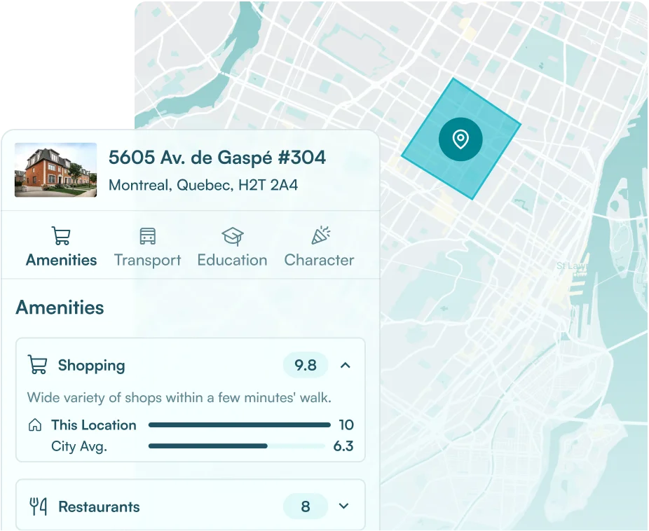
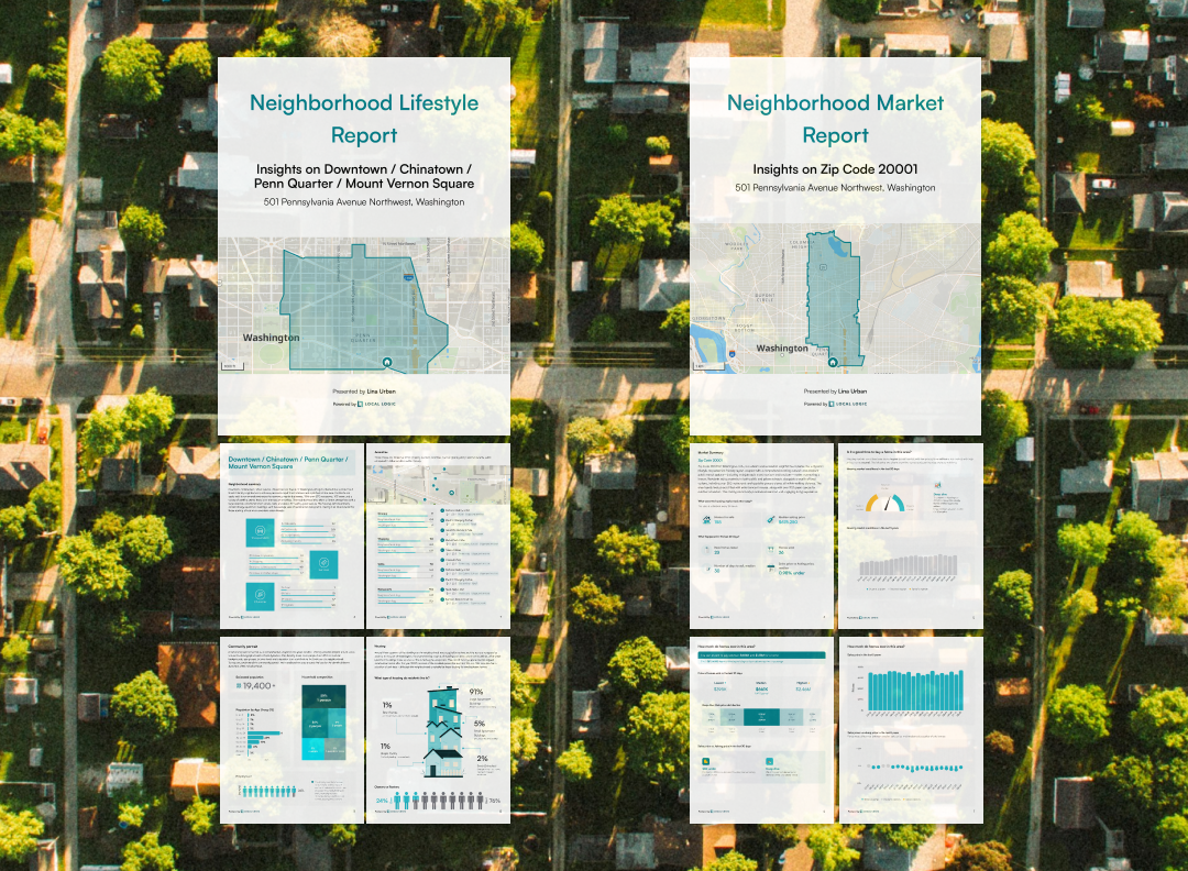
Convert traffic into qualified homebuyer leads with data-rich lifestyle & market reports.
Empower your agents with powerful tools to enhance performance, attract talent, and boost retention.
Keep homebuyers and borrowers engaged over time with branded, lifestyle & market insights.
Boost engagement by helping users explore areas & homes based on lifestyle fit.
Bring listings to life by showing what it feels like to live there, who’s nearby, and what’s around.
Generate leads & stay top of mind with branded lifestyle & market reports.
Improve SEO performance & showcase local expertise with dynamic, content-rich community pages.
Detailed demographic data for any location, that scale with your needs.
18 proprietary location scores across transportation, services, and character.
Detailed neighborhood profiles that enhance your project with rich, human-readable content.
28 POI categories for any location in the US and Canada, with detailed classification.
Detailed insights into POI, scores, and demographics, for any location.
Granular listing and sale for any neighborhood in the US.
Complete picture of school options around any location or neighborhood.
Comprehensive climate risk scores to the impact of climate change on properties.
Drive better home consumer engagement & attract top talent.
Improve lead quality and member satisfaction.
Boost organic traffic, user engagement, and lead conversion.
Build trust early and stay top-of-mind at renewal.
Blog
Case Studies
Masterclass
Newsroom
Events
Documentation
1-8 of 124 results
Partnerships
| 03 Sep 2025
Insights
| 27 Aug 2025
Insights, Product
| 18 Aug 2025
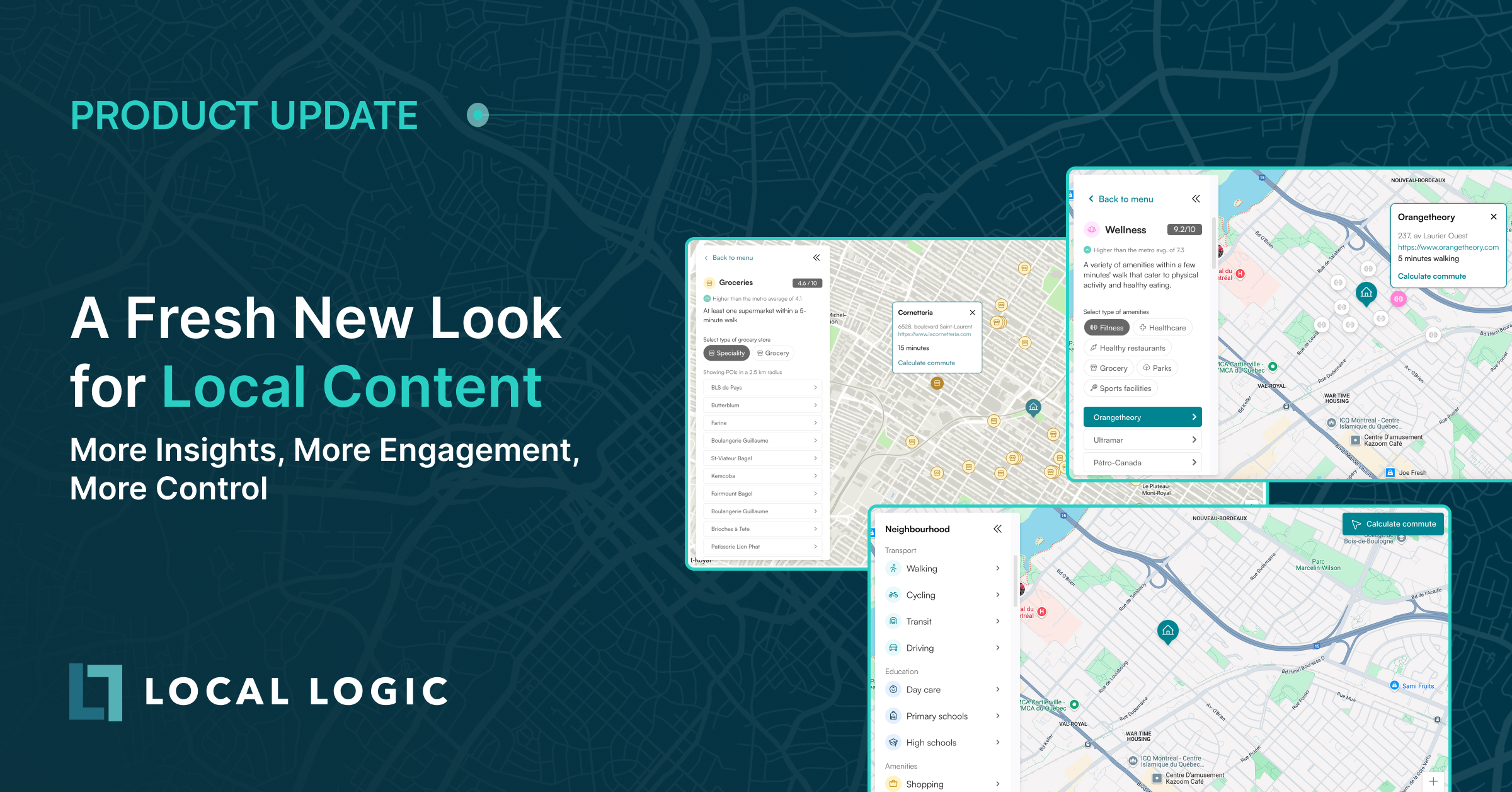
Product
| 06 Aug 2025
| 29 Jul 2025
| 16 Jul 2025
| 10 Jul 2025
| 09 Jun 2025