Local Logic and Elm Street Bring Neighborhood Insights to IDX Broker Agent Websites
Partnerships
| 06 Oct 2026
The question we get asked more than any other is how often our data is updated. It’s the right question. A neighborhood insight is only worth as much as the world it describes, and that world changes constantly in every city we cover.
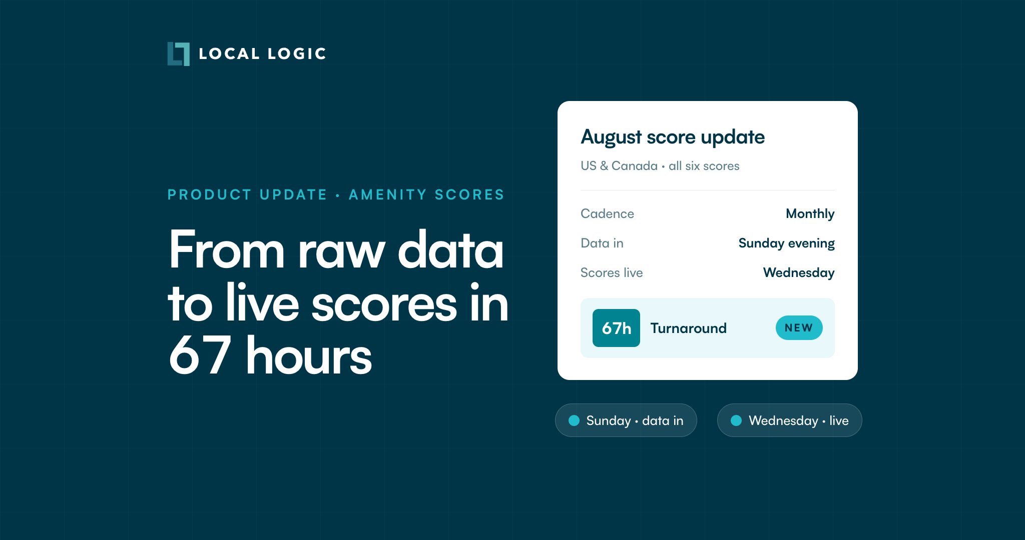
There are two numbers in an honest answer, and we publish both. How often we refresh, and how long a refresh takes to reach you. For our August score update, we ingested a fresh POI snapshot on a Sunday evening and published regenerated amenity scores by Wednesday afternoon. Start to finish, 67 hours.
Here’s what’s new:
Two numbers answer that question. Amenity scores refresh on a monthly cycle, and the August cycle took 67 hours to travel from a raw POI snapshot to live scores in the API.
The second number is the one worth watching, because a cadence only tells you how often we look. The turnaround tells you how quickly what we find reaches your users. A café that opened in early August was ingested, scored, and live inside the same week it started serving coffee.
Freshness is usually described with adjectives, and an adjective leaves the customer to guess what it means in practice. We report it as a number on purpose.
The 67 hours are the output of an ingestion pipeline our data engineering team has spent the last 10+ years building, and that’s continuously improving. Getting raw POI data into a scored, published, address-level form is the hard part of this business, and it’s where we chose to put the engineering.
Consider what has to happen in that window. A raw POI snapshot covering the United States and Canada gets ingested, cleaned, and classified into 36 categories with brands and tags attached. Every one of those places is then routed against the street network, because a café across a river is not a café across the street. Scores are recalculated for 250 million addresses. Then the whole set is validated and published.
Doing all of that over a single weekend is an engineering problem. But raw data is an input, not a product, and the work is turning a massive amount of it into something a home consumer can read at a single glance, as often as the world changes underneath it.
That capability compounds. A pipeline that can regenerate every score in North America over a weekend can also run again next month without anyone treating it as a project, which is what makes a monthly cadence realistic rather than aspirational.
In June, we rebuilt the amenity scores themselves. That release refreshed all six across the United States and Canada, covering 250 million addresses and producing 1.5 billion new score values. You can read the full breakdown in Sharper Amenity Scores for Every Address in the US & Canada.
Three things changed in that release. The scores moved onto the 2026 street network, so streets built in the last few years count. Routing got smarter about highways, rivers, and forests, so a score reflects the trip someone would actually make. And precision improved at the top of the scale, so two dense locations that both look excellent can be told apart.
Most of that pays off hardest outside dense cores. A model built on walking distance through a street grid hands back the same low number for nearly every suburban and rural address, because it measures a trip nobody there was going to make on foot. Ours separates a short walk from a short drive, then routes both against the real street network, where a river with one bridge or a highway with a distant interchange moves the answer far more than it ever does downtown. A rural address in Louisiana and a downtown Toronto address end up measured the same way, against how the people living there actually reach daily life, which is what makes the scores comparable across a state or an MLS footprint rather than only within a single city.
June was about what the scores measure. August is about how quickly they measure it. Same Location Scores, running on a pipeline that keeps them current.
The August scores are already live in our Location Scores API, Local Content — our flagship listing engagement solution, and our Neighborhood Reports. Anything you’ve built on those is drawing on the refreshed data now.
There’s nothing to migrate and nothing to re-request. The same endpoints and the same widgets return the newer numbers.
The bigger picture
Cities change faster than the data most real estate sites run on. A grocery store that opened last month, a daycare that moved two blocks over: small changes on their own, and the whole story together, because they add up to what living somewhere actually feels like.
Sixty-seven hours is how long it currently takes one of those changes to reach the person deciding whether a place fits their life. Shrinking that number is the work.
See what the August amenity scores look like on your own listings and pages: book a demo.
Amenity scores refresh on a monthly cycle, and we publish the turnaround time for each one. The August cycle took 67 hours to go from a raw POI snapshot to live, published scores in the API. That figure is the elapsed time of the refresh itself, so it describes how fast a change in the world reaches your users rather than the age of the data at any given moment.
Our data engineering team has spent ten years building the ingestion pipeline that turns raw POI data into published scores, and it improves with every cycle. Ingesting a continent of places, classifying them into 36 categories, routing them against the street network, and recalculating scores for 250 million addresses runs as one connected cycle, which is how the whole footprint can move over a weekend.
All six: Groceries, Cafés, Restaurants, Shopping, Daycares, and Nightlife. Each measures how much of everyday life is within reach of a given address, on a 10-point scale.
Yes, by design. The scores distinguish a short walk from a short drive, so a suburban or rural address is measured on the access its residents actually use rather than against a walkability standard built for a dense grid. Routing also runs against the real street network, which matters most outside cities, where rivers and limited-access highways make straight-line distance a poor proxy for the real trip.
No. The updated scores are live on the same endpoints and in the same widgets you’re already calling, and existing integrations pick them up automatically.